7 Steps I followed in Crafting the Perfect Button in Figma
Designing a button can sometimes take a half day or a full day and if you say that to any non designers they will look at me like — Are you crazy to take a full day just to create a button? Well today let me share with you what is the process I followed in creating this simple button component which took me almost a day.
Step 1: Design Audit the previous button component
It is crucial to know why you want to create a new button even before you start creating a button. It is always a good practice to start thinking wether I want to update the current existing button component or do I need to create a new component. And here are the things I found in the audit.
We have 4 brands which are running on different design systems and hence we have 4 different types of Button components.
There were huge number of variants in the component which we rarely use. This means more than half of the variants we ended up not using them.
Sometimes when using a button with only icon we needed to change 2 properties leading to increased time in loading Icon buttons.
With these problems listed, we needed to solve them also include the shortcomings of the current system and that leads to the Second Step.
Step 2: Planning
With the introduction of Variables in Figma, we thought we needed to use them to our advantage. And the button component we will be creating should have less variants with some of the variants now controlled with Component Properties. These are the list of things we thought of including
The button should support all the 4 different brands. So we thought of using variants to control the brand switch
The left and right icons in the button instead of having it as variant thought to shift it to Boolean properties for the component along with the Instance swap feature.(Will come to details later )
Remove the unused variants make the variants as less as possible.
The entire styling of the component we wanted to be controlled by Tokens (Figma Variables)
The entire design system should shift the font sizes slightly above or below on a global level so it should also be incorporated in the button component we are creating.
When we import the button, based on the brand we are using it for the styling should change accordingly
Create proper documentation with the properties in sync with the Development.
with the planning done for the button component I started setting the foundation work needed prior to creating the button component.
Step 3: Foundation work
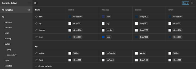
For the foundation work I started with the colours. We created the base colours from scratch using variables. These are the colours we intended to use for all the brands. These colours will be constant and will not be changing any time soon.
2. Then I created the semantic tokens(variables which will refer to the base variables). These are the basic variables which will be used in the actual designs and hence the brand specific colour variables starts from here.
With the semantic tokens done I started with the creation of the font styles. I will be porting these styles to Variables when figma supports text variables in future.
The base text styles should support different modes like small, normal, large. This is actually not possible right now in figma but will be done in future. But as for now I created the base text styles with normal mode.
Then we have semantic styles which are brand specific and hence will have brand specific styles.
Now I also created the variables for Sizes, Border Radius etc.
Step 4: Creating the button component.
Now I can start creating the button component. When creating the component I also need to keep in mind about the developers and other designers. If I say dont look at the moon to a kid all he will be thinking of is to look at the moon. If there is change to make a mistake, then mistakes are bound to happen. It is why we should always create systems where we minimize the mistakes in the system rather than set a guideline to avoid the mistake.
In the button component I am creating we have different heights. But designers can simply change the height post importing the component and then it will not look good when development. Hence I locked the height of the button with the min and max settings like this
Now that height is problem is fixed, created the rest of the button variants like this
Step 5: Setup the component for Prototyping
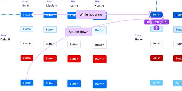
It is time to create basic prototyping for the button so that in future these small interactions come up in the final designs. I setup hover state and focus state for each button variant.
Step 6: Deprecate old Button Component
Now that we have the button component ready it is now over yet. I still need to depricate the old button component. Our old designs are still using this button and hence I cant just delete this component. So I came up with a simple hack. Figma has a simple trick for this. I change the component set background colour to red and rename the component with a Skull in it so that developers will immediately understand to not use the old component.
It will show in the asset panel like this
Step 7: Organise the component for Other Designers and Devs
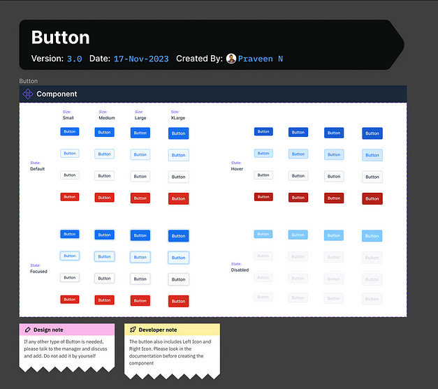
I also organise the Component with details like who created the Button and what date and what is the current version all so that it will be easy for future reference. I also include the Design notes and developer notes in case it is necessary. I added a sample notes just for your understanding.
If you came this long I hope it was interesting for you to read. Now after reading this and if I say it took one full day to create this will you agree with me? 😉
Originally Posted at medium by Praveen Kumar


