Animating Like Apple: Using Figma and Jitter to Design Complex Animations for Web Interfaces
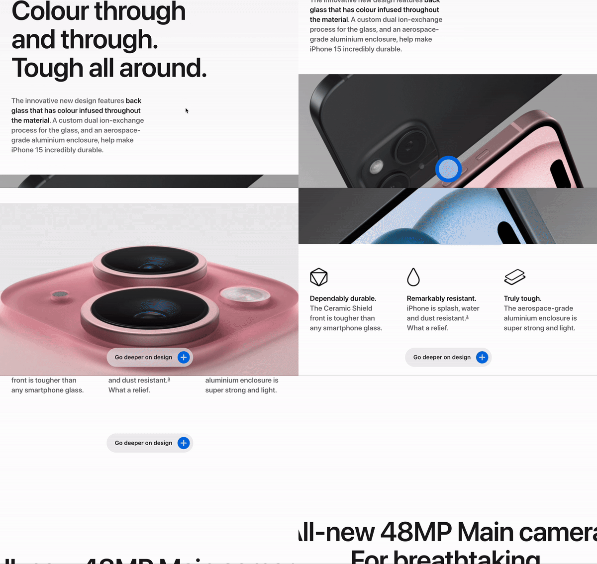
Recently, a client expressed his admiration for the new Apple iPhone 15 website and requested that I design his landing page in a similar style. Upon analyzing the Apple website, I identified several elements that contribute to its appeal:
Minimalist color palette of neutral blacks, whites, and grays
Smooth scroll-triggered fade-in animations; and the impressive video effects — traits that are very characteristic of Apple.
One feature that particularly captivated me was the scroll-to-animate button. Impressed by its fluid and dynamic spring animation, I decided to reverse-engineer this button to incorporate it into my client’s website.
This article will detail the design process of designing the Apple-style button in Figma and animating it Jitter.
Prerequisites
Before we get started, ensure you have the a basic understanding of:
Figma
Jitter
However, even if you’re not familiar with these tools, this article will offer insights into how web designers integrate complex web animations into their projects.
Designing on Figma
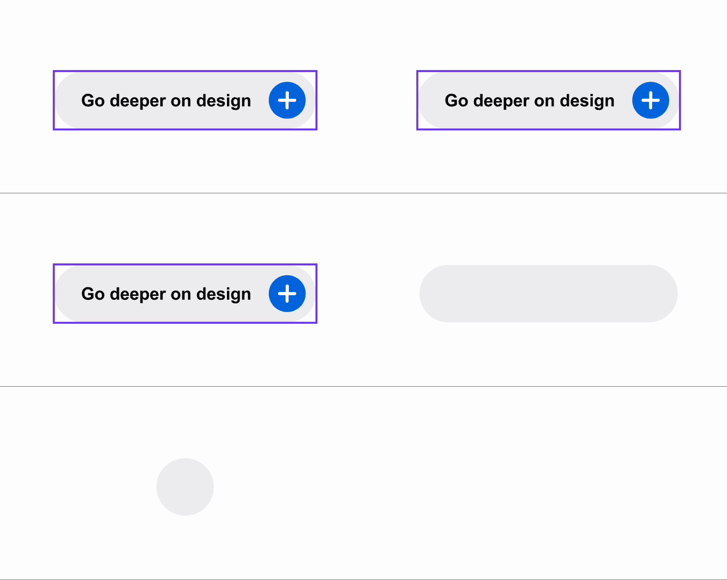
First we will break down the buttons into individual components.
As you can see from the animation above, the button consists of
a gray circle
a larger blue circle
an extended rectangle with rounded corners
an inner blue circle featuring a plus sign.
Next, we will assemble these atoms to form the button. Here is how the button looks with no animation added.
Now that all the elements are in place, we will be exporting to Jitter to animate it! These elements will also play a crucial role when we code the button in the following article.
Animating on Jitter
Jitter is an animation tool specifically designed to function within design and prototyping platforms such as Figma and Sketch. It focuses on adding interactive, animated elements to UI/UX designs. While not a replacement for Illustrator, Jitter excels in animating SVGs and offers its services for free.
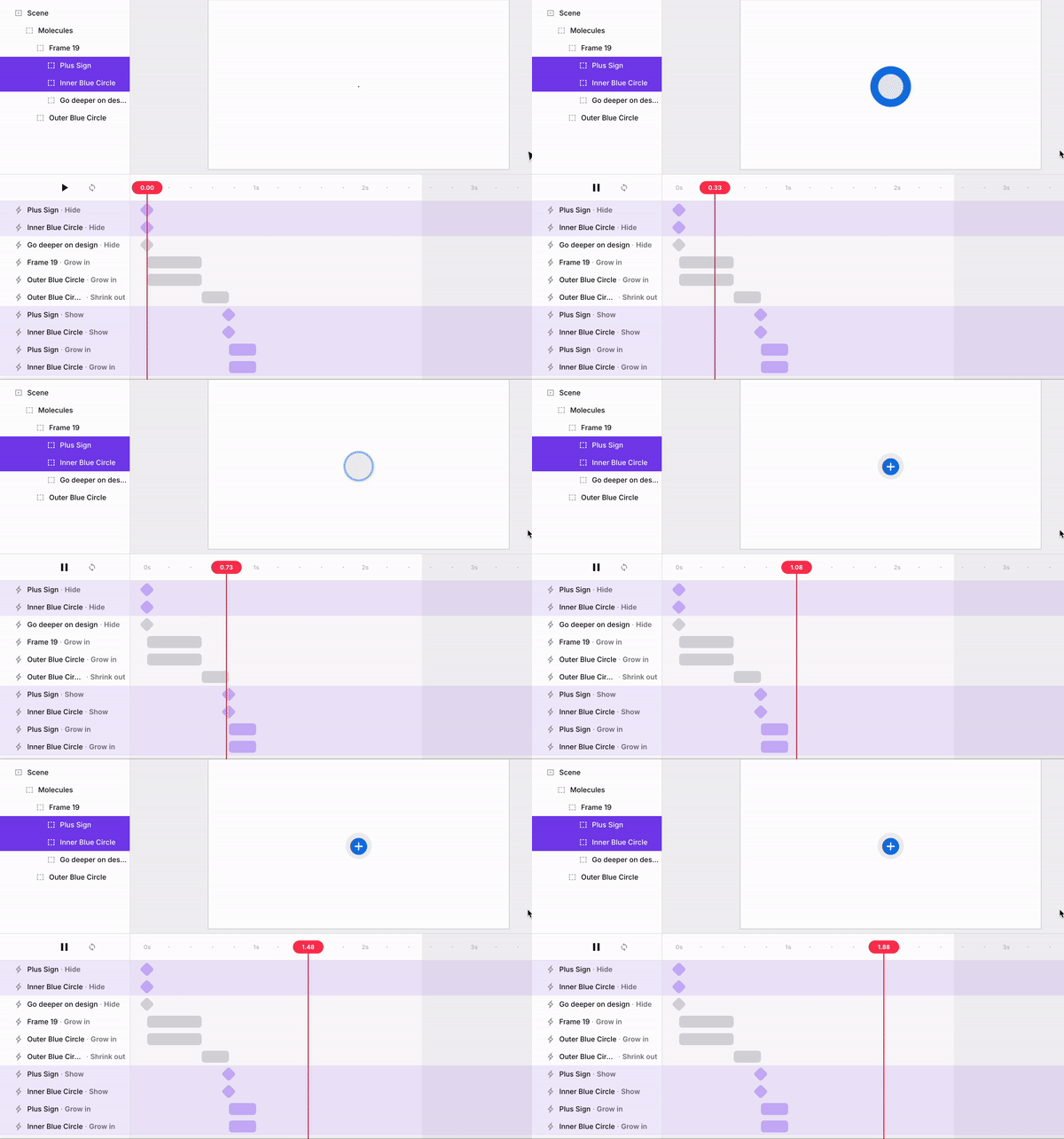
We will animate each individual elements separately.
Hide all elements except the Outer Blue Circle and the Frame.
Change the dimension of the frame to 56 x 56 to form a gray circle. Position the frame in the center of the Outer Blue Circle
Outer Blue Circle and Frame. 0.5s. Grow in from center. Initial Scale: 0%. Easing: Slow down.
Outer Blue Circle. 0.25s. Shrink Down. Final Scale: 50%. Easing: Accelerate
Plus Sign and Inner Blue Circle. 0.25s. Show element. Grow in from center. Initial Scale: 0% Smooth.
Frame. 0.75s Resize width 255.06. Anchor Point: Center. Easing: Overshoot 5.
Plus Sign and Inner Blue Circle. 0.75s. Move X: 199. Easing: Overshoot 5.
Go deeper on design. 0.5s. Show element. Fade in.
I group all the above animations and label it as “Entry”
Now we will do the Exit Animation
Plus Sign and Inner Blue Circle. 0.25s. Shrink Out. Final Scale: 0%. Easing: Accelerate.
Go deeper on design. 0.25s. Fade Out.
Frame. 0.25s. Resize width 56. Anchor Point: Center. Easing: Accelerate.
Frame. 0.5s. Shrink Out. Final Scale: 0%. Easing: Smooth.
I group the above animations and label it as “Exit”
And there you have it! With this, you can export the animation back to Figma. You’ve now learned how to design and animate a button similar to the one on the Apple iPhone 15 website using Figma and Jitter. While the process may be complex, I can assure you it’s both enjoyable and rewarding.
Some of you might wonder why designing and prototyping are important at all. The reason is that by doing so, you can pinpoint the timing of the animation and also export the SVG, which will be helpful to developers in translating the design into code.
Originally posted at plainenglish


