🎨 Building Your Own Design System & UI Kit in Figma
A cheat sheet and all you need to know to create your own design systems & UI kit in Figma.
Over the last six years, I have used different design systems. Some were free, some were paid, and some were systems I built myself. Each of these systems had its pros and cons.
I have created a cheat sheet to help anyone build a design system.
If you want to see this cheat sheet, you can scroll to the bottom. But if you are looking to learn, enjoy this article!
🙌 Let’s begin!
1. Intro & Motivation
Here are a few questions that will help you quickly get started.
Will you be the primary user of the design system, or will someone else be using it?
Will the design system be used for a specific product or application? Or will it be used at the company or team level going forward?
What look & feel should the design system have?
Which UI components will it have?
Actions at this point:
Start your new design system by creating a new Figma file.
Give it a name. I always find it good to choose a name that reflects the vibe of the components.
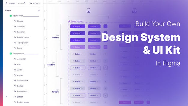
Give the Figma file the page structure you want to use. This is crucial because it will determine how you or others perceive and interact with it. The image below shows an example page structure you could use.
In this particular example, I have created two categories - "Foundation" and "Components" - to group different types of content. Additionally, I am creating a separate page for each style or component included in the design system. I find this approach very helpful, especially when dealing with large design systems comprising over 70 components.
Creating all components on a single page works for small design systems but becomes more challenging beyond 20 or 30 components.
If you plan on using a page structure similar to the example, I recommend creating all pages (one for each style/component) before you start building them.
2. Build the foundations
I call it foundations because they basically define and set how the UI should be built. It sets the guidelines and best practices.
This section can include the definition of these styles/aspects:
Color palette
Shadows/Elevations/Focus styles
Number variables (Spacings, Paddings, Roundings, Sizes)
Typography
Faces (for avatars)
Grids
Color palette
To add your colors in a stylish way, you can use the Local Variables section. Here, you can create a collection and add various modes to your color. This is how you can add the light/dark mode capability to your design system.
Actions in this step:
Choose colors (HEX, RGB, or others) you want to use
Create the collection in the Local Variables section
Add variables for each color style.
Recommended styles to include:
The brand's primary color. This color will be the accent color as well
If the brand has a secondary or tertiary color, add it too
Neutral colors (whites, blacks, greys)
UI State colors (success, danger, warning, info)
Gradients or background colors
Optionally, include additional colors, but you should have all you need with the colors above.
The feature "Local Variables" is currently in beta as of February 2024; however, it is already saving a lot of time for multi-theme applications.
It is considered good practice to create separate variables for different uses when working with user interface design. For example, instead of directly using the color code “grey/10” for component backgrounds, you should create a new variable called “ui/background” and assign the desired color to it. This way, you can separate color codes from their uses in the UI, which makes it easier to modify them in the future.
Shadows, Elevations, Focus Styles
Create local styles for your shadows in Figma. These styles can be used when publishing the file as a library. I will explain how to do that later in this article.
Actions in this step:
Define how your shadow, elevations, and focus styles are going to be, and create them in the Local Styles section.
There is no right way to create these styles, just as there is no right way to structure a page. I recommend separating shadow styles from elevations and focus styles.
Number variables (spacings, paddings, roundings)
Just like we did with colors, we can use local variables to create a collection, this time focusing on number variables.
Actions in this step:
Create a collection in the Local Variables section.
Add variables for each style.
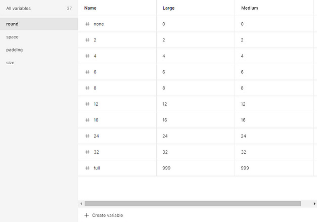
I created a collection for this example and added all my number variables. Instead of having a “light” and “dark” mode, this feature can be used to set different values based on factors such as sizes, devices (desktop, tablet, mobile), etc.
Typography
The colors and font styles are essential in any design system. Defining font styles will save you a lot of time when building interfaces.
A useful way to define these styles is to group them by:
Titles/heading styles
Body or paragraph styles
Label text styles
Button text styles
Link text styles
Actions in this step:
Choose the font or font families to use.
Create text styles in Figma for each font style you want to use.
Faces (for avatars)
Create local styles and add images of people to access them later easily.
You can easily find free avatars in the Figma community or generate them using AI.
Although it is optional, I highly recommend doing it so that you can access avatars easily and use them in your components.
Actions in this step:
Find some avatar images you can use.
Save them in the local styles section.
Grids
Use grids to set the different layout options in your design system.
I initially found using grids complex, and even now that I use them in my designs, I think this feature could be improved.
Given this, I want to assure you that having well-defined layouts will save you time and ensure consistency in the look and feel of your user experiences across different sections of the application or website you are building.
Actions in this step:
Define your layouts and create their styles in the Local Styles section.
3. Build your components
This is, without a doubt, the funniest part when building your own design system. Here, you can finally bring your design system to life and see it for the first time.
Here are a few things to keep in mind from my experience:
Before you begin building your components, it is important to have a list of the components you want/need to include. As I mentioned previously, I suggest creating each component separately on its own page and having all of the component pages created before beginning the actual building process.
It's better to start with the small components; with the ones you know, you will need to create other components. For example, if your design system includes a toast component, and you want to have a variant of that component with a close button, then you should probably start by creating the button component first. The same goes for the rest of the components.
Establishing a clear naming convention for component properties and variants is important to ensure consistency across repeated properties and names.
Define if and how you are going to document the component, the variants, and properties.
Actions in this step:
If you haven't already, create pages for all the components.
Define the properties and variants that each component will have.
Build each component. I would love to have articles showing how to create each specific component, but it’s up to you! Let me know.
4. Testing your components
After building all the components, or even better, after creating each one, it is recommended to take some time to test those components for:
Bugs or defects in the variants.
Errors such as spelling, grammar, and punctuation mistakes in the text or properties.
Contrast checks.
If your component supports light and dark modes, make sure to test if the correct colors are applied during mode switching.
Accessibility tests. There are a lot of plugins in the Figma community to help with this.
When designing the system, I always consider how I would want a component to be in order to use it, whether it's me or someone else using it in the future.
Actions in this step:
Check the components for defects and possible improvement opportunities.
Solve any detected issue.
5. Publishing your design system
There are several methods to share and start using your new design system in Figma:
Share the .fig file by downloading and importing it into other Figma teams or projects.
Publish the design system as a library so that you can easily use all styles and components across different files. Note that this feature is currently only available in paid plans.
Publish your design system in the Figma community.
In this article, I will demonstrate the second option for publishing the file as a library.
Publish a design system as a library
Once you have finished building and testing all components and styles, the only remaining task is to publish and start using them.
To publish the file as a library, go to File > Libraries.
You will see your current file at the top, next to a “Publish” button.
Once you click the publish button, you can review a list of all styles and components that will be published. This list allows you to include or exclude specific components from the publishing process if you don't want them to be published.
To initiate the build and publish process, simply click on the "publish" button again.
Cheat sheet
Here’s the cheat sheet or step-by-step guide:
Create the file.
Give your design system & UI kit a name.
Give the file the page structure you want to use.
Create all the pages for all the styles and components you want to include.
Create two collections in Local Variables, one for colors and one for numbers.
Create all the foundation styles and variables (colors, typography, shadows, etc.).
Build all the components with their variants and properties.
Test all components & styles.
Publish.
Conclusion
Creating your own design system can be time-consuming, particularly if you are designing one with a large number of components, say 20 or 30. However, the rewards of building it and using it are immense. Once you have created the first version of your design system, you'll feel a great sense of achievement and satisfaction.
Once your first version is ready, improving the existing components or adding new ones will feel like a small task.
I hope this article was helpful! If you enjoyed reading it, please share your experience creating your own design systems and leave a comment below.
Have a great time designing! 😀
With love,
Agustin Maidana.
Originally posted at medium by Agustin Maidana.


