Creating a Multilayered Component in Figma
Figma allows Nested Properties to show up in the properties panel. This has led me to think of creating a multilayered Component. Recently I started revamping my design system and I thought I should try this multi layered approach to one of my component. I have chosen Input Field for this.
What is a Multi Layered Component
Well multilayered component is the one which has more than one layer of base component. I create a base component to control certain properties and then using that I create another component over it and so on.
With the introduction of Properties the number of component variants to be created has reduced drastically but what if there are properties which cannot be controlled by properties and the variants pile up to huge numbers. That is where the multilayered component system comes in which keeps reducing the number of variants by half every time you add a new layer.
Planning the Input Component
The previous Input component I created was having many properties but was lacking in customized outputs. Like if I wanted to have a search field I needed to import a input field and then change the Leading Icon and Label and Input Text accordingly. This was a huge time waster and if I wanted to include every type of Input field in the component it would pile up to hundreds of Variants which is very hard to maintain.
In creating multilayered component planning is utmost important. Once the component is created there is no going back. You need to either create a new one or live with the one you created.
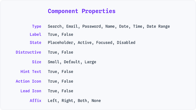
Knowing so, before creating the Input component I started to list down all the properties I want to control for the Input filed. Once I have it I breakdown into layers so that it can be used to create the stages of components.
Segregation of Properties to Layers
Now I know what to control so I need to segregate the properties to different layers. The most frequently tweaked properties comes at the final component and the least tweaked ones come first. This is how I segregated the Properties which I will be creating in each layers of the components
Creating the actual component
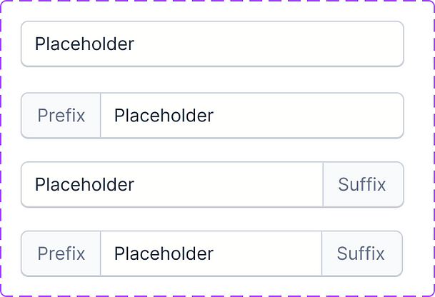
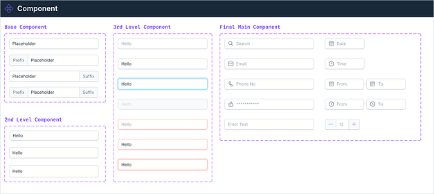
Now that I know what to be created I started with the base component.
Then using this component, I took a instance of it and started creating the 2nd Level component which controls the property Size
Then the third layer controls the Hint Text, State and Is it Destructive or not. I didn’t want to break this layer since there are just two variant properties and one boolean property. Again I took the second layer component and used its instances to make this component. This has 7 Variants when created.
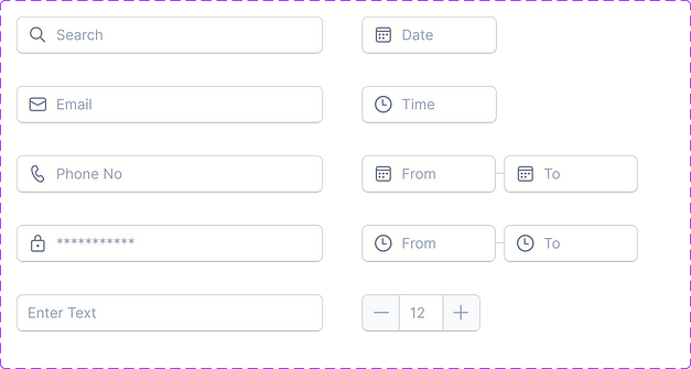
With this now I am able to create most of the component types like Email, Search etc in the final component.
For the last and final component which will be the only component which will be public, the other ones will be private components, I have taken all the variants I will be using in my designs like Email, Password, Date etc.
This is how I ended up with all the functional Input fields as the final component. If I end up using any field frequently I will be simply adding it here.
The properties panel will look like this when I import this final component.
Conclusion
This is very good for maintainability of the component and to add any number of Functional Input Types to the Final Component. If I want to add another size variant, I don’t need to create multiple component variants rather just add one version to the 2nd Layer component.
This is the final component Variants I needed to design for entire Input Field Component Design
If you want to see how I will be creating other components in the design system, you can follow me to get notifications when I post. Comment if you have any doubts or need any clarity in this component. I will be always happy to help.
Originally Posted at medium by Praveen Kumar


