Dark mode UI design. Organizing color variables and naming.
This guide is useful for UI Designers and front-end developers.
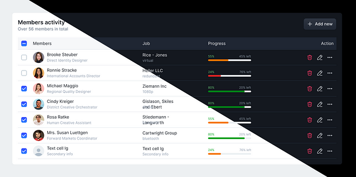
I prefer using dark mode for all applications as it is less straining on the eyes and saves device battery power. In the past, UI Designers focused primarily on light mode. Dark mode has become increasingly popular in recent years, Designers started creating also a dark mode of their UI.
In 2023, Figma introduced multiple color modes through variables, and it was a game-changing for everybody who uses Figma.
The problem is that many UI designers don’t follow specific rules when they design for multiple color modes. Mostly, UI designers just turn white or lighter colors into black or darker colors.
Dark mode is not just about switching everything to dark colors. If you do so, you will loose consistency in dark mode. Another common mistake is most designers doing wrong with primary and accent colors in dark mode. It’s essential to adjust all colors (including primary, accent, danger, etc.) for dark mode instead of leaving them unchanged.
Many UI/UX designers lack knowledge of CSS. (I always say that UI designers should also have a basic understanding of coding). So, when design files are handed over to front-end developers, they may encounter difficulties organizing CSS color variables. With proper color naming and structure, it’s easy to switch between light and dark modes using CSS variables. That’s why this topic is important both for designers and front-end developers.
Avoid naming colors as “gray-100,” “gray-200”, or “white”, “black”.
You know, in light mode “gray-100" is closer to white (lightest gray is named usually gray-100). For instance, you might use it for a card’s background in light mode. But in dark mode your card’s background should be closer to black (darkest gray) color.
Therefore, it will be confusing to name the darkest gray as gray-100 in dark mode.
If you name main background as “white”, but in dark mode it converts into black. You can’t keep same name “white” for dark mode. Another thing is, in light mode text colors usually black, But in dark mode you can’t name them as “black”. They will appear white.
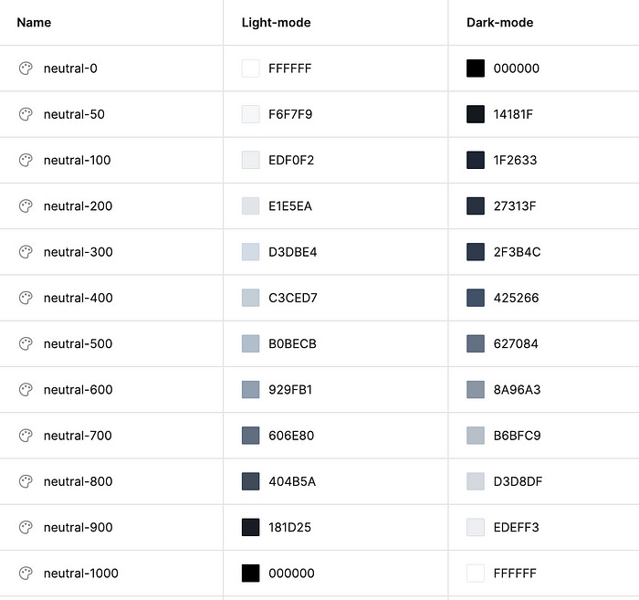
Here's my solution: Use names like “NEUTRAL”, For ex, “neutral-0” means no color or default color in both dark mode and light mode. Or in other word default background can be named as “neutral-0”. It means absolute white in light mode, absolute black in dark mode.
Here is my approach of using Figma’s variable colors.
So you’ve created your colors for neutral (or grays), But you’ll encounter another issue when using them for backgrounds. Now let’s talk about using neutral colors for different backgrounds.
Background colors become more complex.
Now let’s start with basic UI example with white background, a card and black text. You may think that, changing into dark mode is straightforward: You just convert all white backgrounds into black and black text colors into white:
But, what if your UI has multiple background gray colors, and you have some popover elements, drop-downs and cards. In that case, it is NOT recommended just to apply colors from “neutral” library.
So what’s wrong with applying neutral colors for the background?
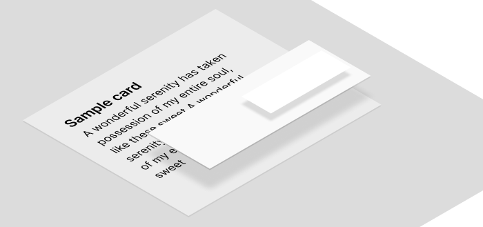
Think about the interface as a real 3D surface, where elements stack on top of one another. The closer elements or those on top will appear lighter, while those further behind will appear darker.
That’s why you should be careful with background colors; otherwise, your dark UI will look unrealistic. Here’s my solution for that: After defining all neutral colors, I create another color group for backgrounds (or surface colors), then I assign my neutrals to them.
Some designers create specific color variables for each element, such as “background-dropdown-color”, “background-card”, “background-tooltip” and so on
However, I don’t use that approach because I have no idea how many elements will be in my app. Creating a color variable for each element is time-consuming. Instead, I have another solution to keep colors minimal. I use more generic name like “surface-base” for cards or any background behind the main content. For dropdowns, and modal dialogs, or popover elements, I use “surface-raised” or “surface-elevate”. In light mode UI, both cards, dropdowns and modal dialogs will have the same white color. The only difference is that I use more shadows for dropdowns, less shadow or no shadow for cards. So, shadow gives some depth in light mode. But in dark mode you can’t use shadows because they are invisible (Can you see a shadow in a dark room without lights?). So, the solution is to use a lighter dark color for dropdowns to distinguish them from cards or the main content.
In the above example, you can see that in light mode, the card and dropdown have a white background (neutral-0). But in dark mode, dropdown is a bit different than card. We used nautral-100 for card, nautral-200 for dropdown.
This makes the interface more realistic, as if the dropdown is closer to you.
Using other colors (primary, accent, warning,… ) in dark mode.
How about blue, orange, red colors in dark mode? What about warning texts?. It is important for dark mode never to keep your primary colors as they are. Result may be something like this: ((shown below)
That’s why you should create dark versions of all primary colors for both texts and backgrounds.
Create two groups of primary colors
Primary colors for surfaces — button backgrounds or other backgrounds. Colorful backgrounds should be adjusted for dark mode.
Primary colors for texts. Colorful texts should be more lighter in light mode.
How about icons? I usually consider icons as text, so I don’t make things complicated. I simply use the colors of text for icons as well.
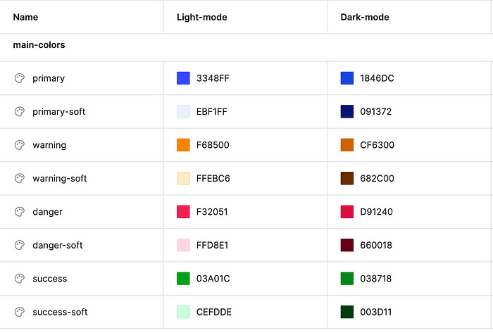
Here are my primary colors for light and dark mode
Here is primary colors for fill colors (or backgrounds of element)
You can see there are colors like “primary-soft”. They are more closer to white in light mode. But in dark mode they are more closer to black. Here is real example of how it is used in both light and dark mode.
The above screenshot is just an example showing that any text against a black background must be visible. Therefore, always adjust them according to accessibility standards. Here is the link to check accessibility: https://webaim.org/resources/contrastchecker/
You will need also constant colors
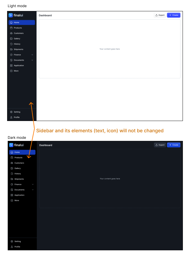
Sometimes, you may need colors that remain consistent across any theme. A common example is the dark sidebar of an admin panel. Here is a sample:
Create colors like “const-white” or “const-primary” or “const-gray-800” and apply same values for all color modes.
Final words
Creating the perfect color palette is not easy; other designers may have their own approaches. If you want to save time creating interfaces for dark/light mode, try using a design system that supports multiple color themes.
I’ve developed a new design system that enables you to create stunning UI designs in both light and dark modes quickly.
Check it out here: 👉 finalui.com
If you found this article enjoyable, follow me and sharing it.


