Design Tokens: Beginner’s Guide
Design tokens are the building blocks of design systems. Design tokens adoption ensure unified, flexible and scale-ready design systems.
Overview
Design tokens store repetitive design decisions in a platform-agnostic way. Design tokens act as a single source of truth for the design system.
Single source of truth (SSOT) refers to the centralized repository which acts as a single point of reference for different artefacts.
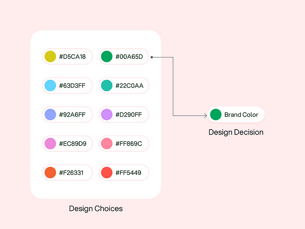
Design decision refers to the choice that the designer makes from the available choices, like choosing a brand color, typeface, or deciding spacing between a heading and paragraph.
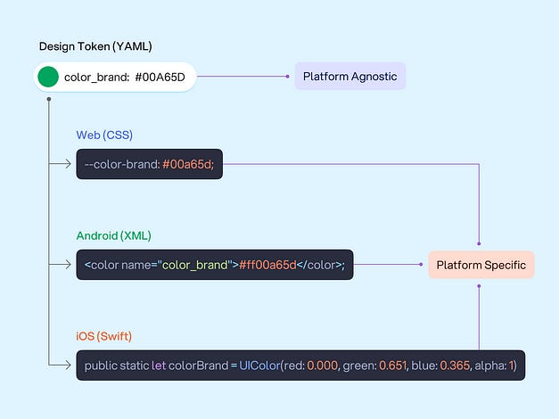
Design tokens are independent of any specific platform or tech stack, which makes them platform-agnostic. It makes it easy to implement design tokens across different platforms and technologies.
Design tokens are generally defined in human readable format like YAML or JSON, but they can be defined in design tools too.
Translation tools like Style Dictionary, Theo, etc. translate platform-agnostic design tokens into platform-specific values.
For example, design tokens may use hexcode color notation while iOS may use RGBA and android may use 8-digit hexcode color notation.
Design tokens primarily focus on visual design decisions, like color, typography, spacing, elevation, etc. but they can also represent non-visual design decisions like motion and assets.
Using design tokens instead of hard-coded values help to ensure flexibility which makes it easy to build, maintain and scale the design system.
Simplifying Design Tokens
Let’s start with an analogy to simplify the concept of design tokens —
Phone Contact Analogy
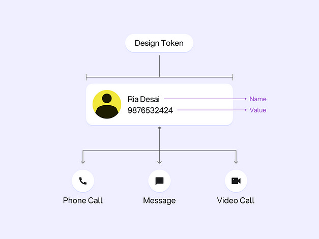
When someone saves a phone number in their contact list, they eventually create a token that represents a person’s contact information. The token contains information like name and phone number.
This token enables making phone calls, sending messages, making video calls, or even sharing the token itself as a contact with others.
If the person’s phone number changes, we only need to update the token’s value to reflect the new number, and all associated functions automatically use the updated value.
Coffee Cup Analogy
Another simple analogy could be 3 differently sized coffee cups, each printed with a label representing its quantity in ml.
However, in case if we ever need to change the quantity of coffee within these cups, the printed cups will become ineffective.
Using tokens to label coffee cup sizes as small, medium, and large makes it easy to adjust the quantity whenever needed — this is more flexible and scalable approach.
Role of Design Tokens in Design Systems
Design tokens are human readable tiny modular blocks that come together to create a system that is flexible, customisable and ready to scale.
Let’s try to understand with an example how adopting modular design tokens brings flexibility and scalability to design systems.
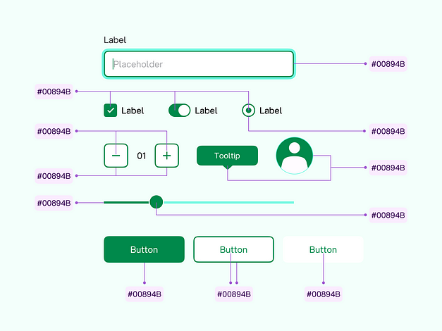
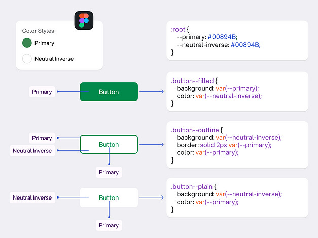
Let’s say you choose a specific color as your primary or dominant color and use it across different components like button, radio, checkbox, toggle, slider, stepper, etc.
Now at some point in time, if you decide to choose a darker shade of your primary color, you will have to manually search for the corresponding values in design tool and respective codebase to replace them.
Using Styles in Figma or other design tools and Variables in code can handle this challenge and bring scale to some extent.
But using Styles or Variables alone can not solve other complex challenges like changing the primary color only in components where it is used as a background — this is where design tokens come into play.
Design tokens are not just limited to a color system, design tokens can store everything from type or spatial systems to design assets.
Design Token Types
Design tokens primarily have 3 types —
Global Tokens
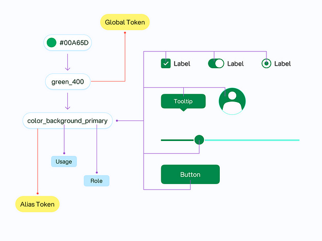
Global tokens are primitive values. Global tokens refers to a comprehensive list of all available choices within a design system. Global tokens are also known as base, options, choice or reference tokens.
Global tokens represent static values like color hexcode, type size, spacing, etc. Global tokens are context-agnostic and does not have any associated explicit meaning or intent.
Global tokens can either be directly used or referenced by other token types (alias or component-specific tokens) within a design system.
Alias Tokens
Alias tokens are context-specific and reference global tokens. Alias tokens are also known as semantic tokens.
Each alias token has specific intent of use, meaning, and role associated with it. Unlike global tokens, alias tokens appear specifically in predefined contexts or instances.
Alias tokens have different nomenclature for different token categories like colors, typeface, spacing, motion, etc.
Nomenclature for alias tokens should be abstract enough to adapt different values and meaningful enough to explain the intent or purpose of use.
Using alias tokens enable effective, flexible, and easy maintenance, as the pointing global token values can be changed whenever required.
Component-specific Tokens
Component-specific tokens explicitly store and represent unique and specific design decisions associated with a particular component.
Component-specific tokens ideally points to alias or global tokens.
Multi-Tier Design Tokens Hierarchy
Global, alias and component-specific design tokens can represent different tier’s of design tokens. Multi-tier design tokens hierarchy enables concept of isolation and control within a design system.
Isolation refers to how independent a design token is. The level of isolation determines the impact that each design token update will have across the entire design system.
Global tokens store universal choices. Global tokens represent higher-level design decisions and thus don’t have any isolation. Any change made to global tokens reflect across a range of design decisions within a design system.
In the example above, updating green_400 global token will impact both color_background_primary and color_border_primary alias token dependent design decisions. Such updates have larger impact within a design system.
Alias tokens have specific intent and meaning. Alias tokens are mid-level design decisions and have limited isolation. Updating an alias token will reflect in specific contexts.
In the example above, updating color_background_primary or color_border_primary will affect the alias token dependent design decisions only. Such updates have medium impact within a design system.
Component-specific tokens are defined at component level and have maximum isolation. Updating a component-specific token will only reflect in a particular component.
In the example above, updating button_color_background or button_color_icon will only affect the component-specific design decisions. Such updates have low impact within a design system.
Multi-tier tokens come in handy to create a modular and flexible design system. The spatial system demonstrated below is utilising multi-tier tokens to establish a more flexible and modular spacing system.
Multi-tier tokens enable more control for the customisation.
In the example above, 2-tier token approach has limited flexibility as updating the space_md alias token will affect padding in both dialog and search components.
While the 3-tier token approach is more flexible as spacing tokens are isolated at the component-level, modifying the token will only impact the specific component.
Summary
Design tokens are modular, platform agnostic building blocks of design systems that store repetitive design decisions. Design tokens act as a single source of truth and enable flexibility and scalability within design system.
Design tokens primarily have 3 types which can form a multi-tier hierarchy to establish more controlled and flexible design systems.
Using design design tokens instead of hard coded values ensure more flexible design systems that are easy to build, maintain and scale.
Originally posted at medium by Nitish Khagwal

