Introducing all-new Gen-AI powered Ratings and Reviews on Cleartrip
In 2000, TripAdvisor popularised the ratings and reviews for the hotel and restaurant industry.
Fast forward to 2023; video reels, rich media, summaries, and quick insights are one prompt away. However, the conventional approach to representing the Review and Ratings has remained the same.
Imagine a bite-sized visual insight backed by an in-depth summary of a decision lever to find a perfect stay.
Here’s the design journey of the enormous collaborative work done by tech, product, and design.
Chapter 1 — End of conventional ratings and reviews on Cleartrip
A product manager set up a PRD walkthrough meeting in the first week of October 2023. The title was “Ratings and Reviews | Phase 1.” The Short and crisp title PRD unravels the truth of our long-overdue dependency on TripAdvisor ratings and reviews.
Moreover, it highlighted concerns over fake reviews and outdated data, the importance of building users’ trust by gathering their reviews, and the competitor’s latest take on ratings and reviews.
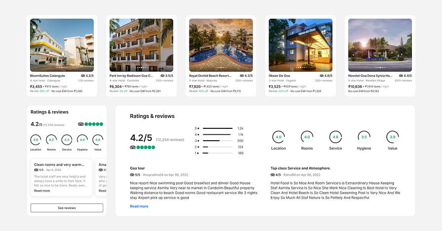
Current representation
Travellers compare overall and individual aspect ratings, read a few reviews and book a hotel while considering other personal preferences.
Dilemma
The top 100 hotels on the search result page mostly have ratings between 3.0 and 5.0. Have you ever wondered about the difference between 3.8, 4.2, and 4.8?
An exciting takeaway from our research was that travellers are suspicious of hotels with only positive reviews.
Travellers read the negative reviews in depth to decide on a hotel. Only a few negative reviews of the hotel were good enough to drop the hotel.
Through research, we have identified the following critical travellers’ problems.
Time & Comprehension — Travellers spend more time comparing and comprehending property information based on their preferences.
Trust — Travellers often doubt the credibility of reviews and the reviewer, especially when encountering fake or biased ones.
Depth of Insights — Missing details or evidence makes it hard to understand the specific context of reviews.
Relatability — Travellers prefer reviews from similar backgrounds to assess the relevance of their needs.
Relevance — Travellers want reviews focusing on what matters most, like amenities, location, or service quality.
Recency — Ratings must reflect a hotel’s current state, which can lead to misleading decisions.
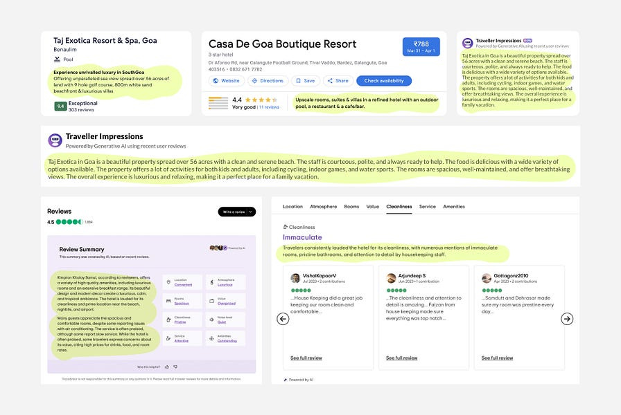
Each review is a collection of informed decision-making levers. Each hotel usually has 500+ reviews on the platform. Going through all the reviews is impossible, but we have GenAI. Online hotel booking platforms have started showing review summaries to get the overall sentiment of travellers’ experiences.
Using GenAI to summarise the reviews saves time, but the trade-off of human emotions is challenging. We need more than just dumping a text summary. We need a visually appealing, human-centred representation of the review and rating.
Now that we know what we need to do. We planned the execution of the project into three phases.
Phase 1 objective: “Our primary focus will be delivering visually appealing, concise, and relatable insights to travellers during the hotel booking process. These insights will be presented in a snackable format, making it easy for users to grasp essential information on the Hotel Details Page.”
Chapter 2 — Reimagined the ratings by discovering the missing pieces.
Overall ratings
First, let’s talk ratings. A considerable, bold number is the first key identifier to shortlist hotels.
We brainstormed how travellers interpret the rating number and what helps them shortlist the most suitable hotel. How does a bold number make sense? What are supportive metrics that validate the ratings?
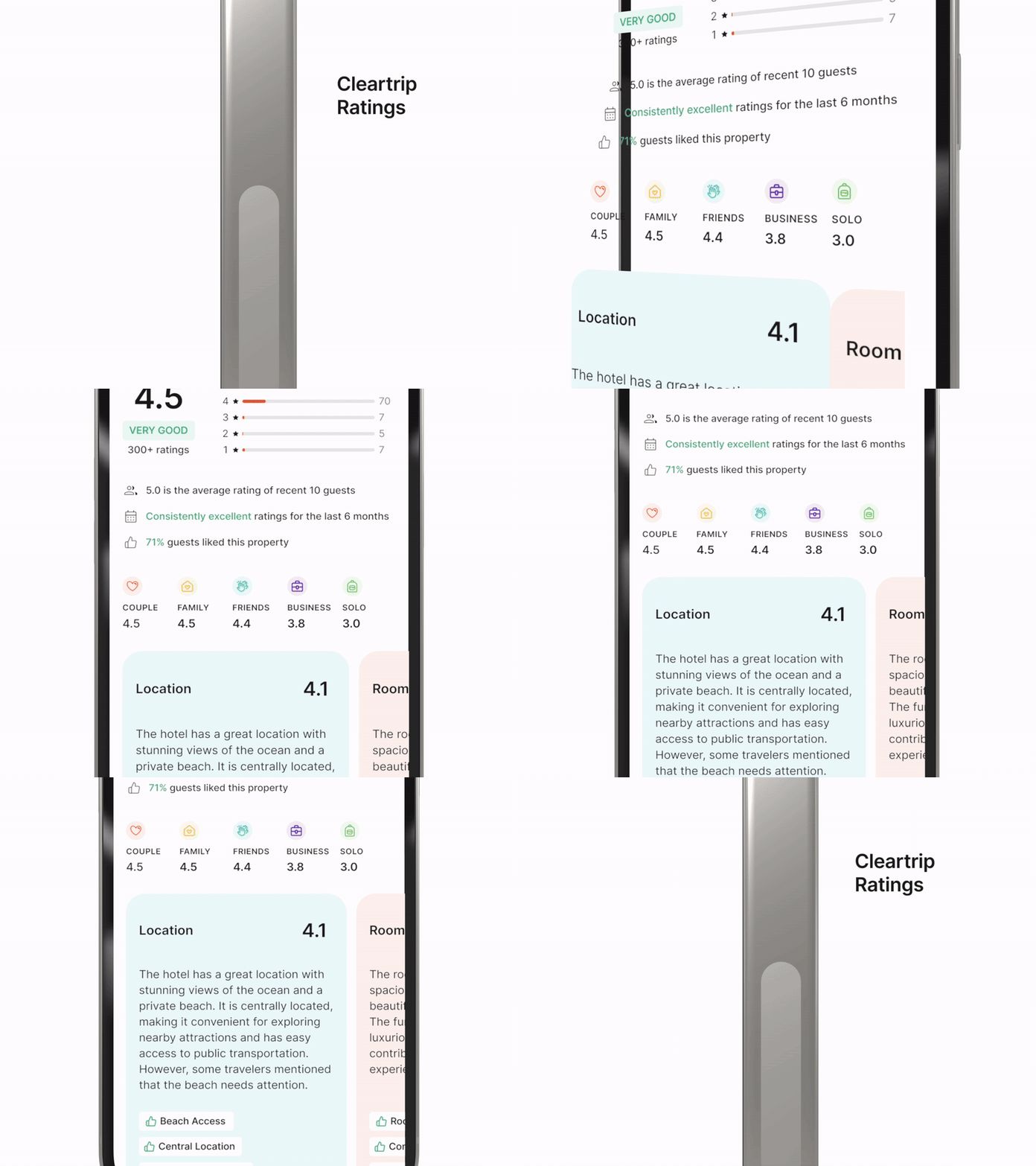
Ratings can be the only critical decision lever if they represent three other essential metrics: recency, consistency, and overall sentiments.
✅ Recency: Account for recent experiences, ensuring the reviews and ratings reflect the latest traveller insights and the hotel’s standard.
✅ Consistency: Consider & mitigate variations in a hotel’s performance resulting from management changes and renovations to ensure a consistent & positive traveller experience.
✅ Sentiment: Traveller’s reviews are a rollercoaster ride of emotions — average the sentiment percentage to form the emotion for their hotel stay.
These metrics also differ between hotels and provide up-to-date information about ratings, which would be one of the decision levers for the traveller.
Individual aspects rating
The second concerns individual aspects of hotel amenities ratings. Each aspect hides the rollercoaster emotions of the travellers’ experiences. How can numerical representation be made more credible?
Humans have a bias toward validating what they see. What if a quick overview backs individual aspects? We explored various approaches to representing aspect ratings and have added a text summary and sentiment pills to support amenities ratings.
✅ Quality: Provide quality by maintaining rigorous review standards, even if ratings differ from competitors.
✅ Relevance: Value the inclusion of diverse traveller experiences and fine-tune ratings & reviews to match individual preferences.
✅ Trustworthy — Provide an unbiased perspective to build confidence.
Persona ratings
The last one is Persona ratings. How is the hotel favourable among personas? We have identified five personas for a rating scale of five: couple, family, friend, solo, and business.
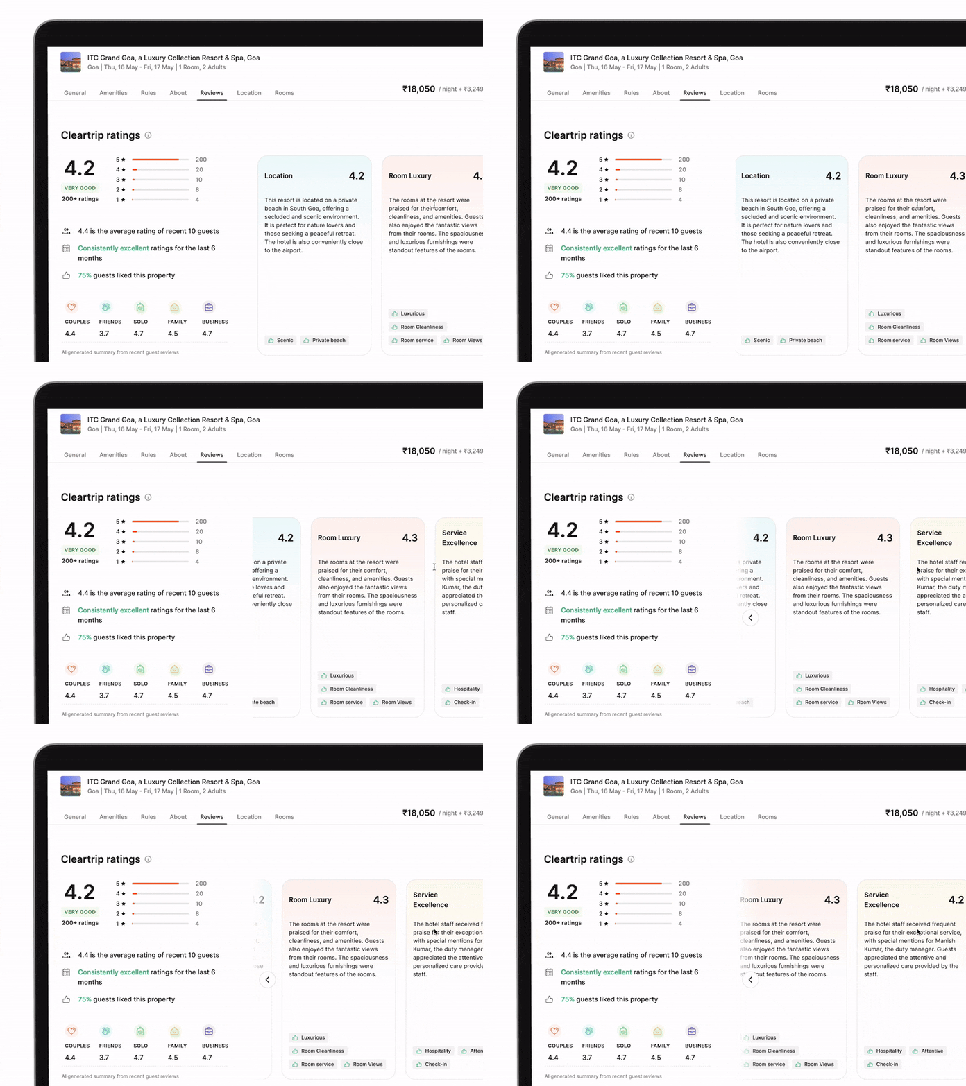
Overall ratings, individual aspects ratings and persona ratings — All three critical pieces of information are part of the Cleartrip Ratings section. On desktop and mobile, it takes two or three scrolls to reach it, which provides in-depth information on the hotel details page
How do we intrigue travellers to reach Cleartrip ratings section?
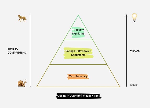
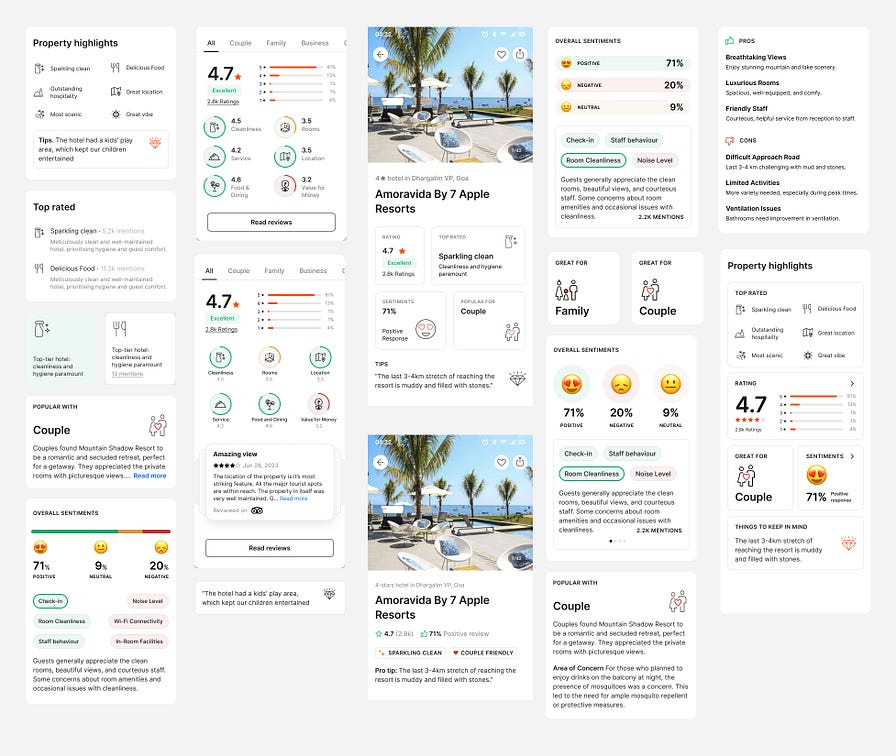
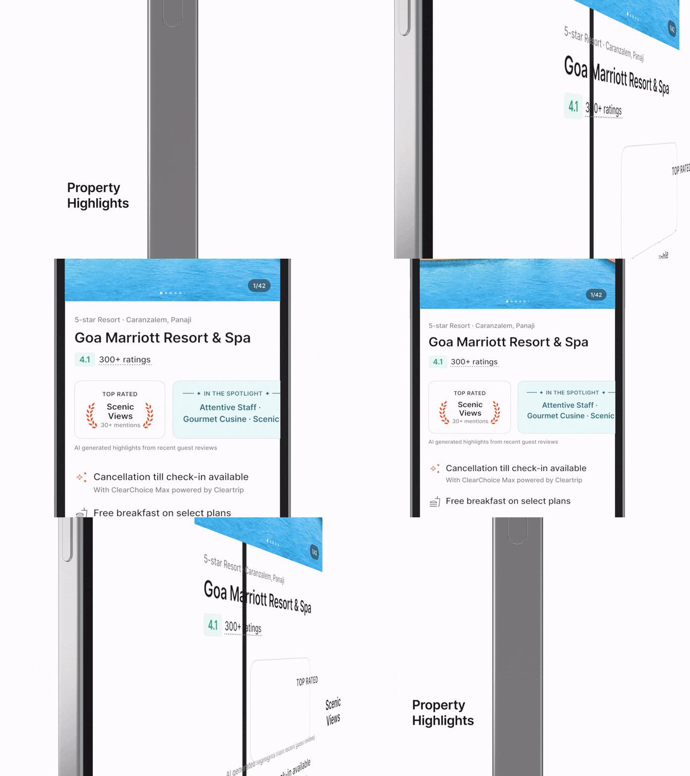
Our next challenge is to summarise all this information into bite-size pieces so that travellers can comprehend it in seconds without scrolling. We call this section Property Highlights, which appears right below the hotel name.
Top Rated: Which is the most mentioned hotel rating aspect and why?
In the Spotlight: What are the top three pivotal highlights of the hotel?
Great for: Who rated the hotel the highest among the traveller types?
✅ Comprehension: Reduce the user’s cognitive load when finding the perfect hotel before diving into in-depth information.
Cleartrip Ratings and Property Highlights: Two sections have the necessary decision levers for glances and in-depth reviews. It’s time for visual design.
Chapter 3 — Beautifying ratings: papers to pixel and motion
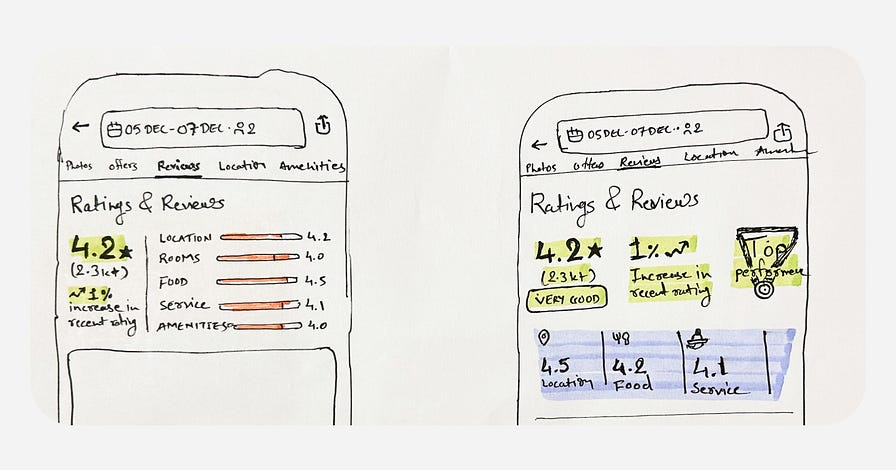
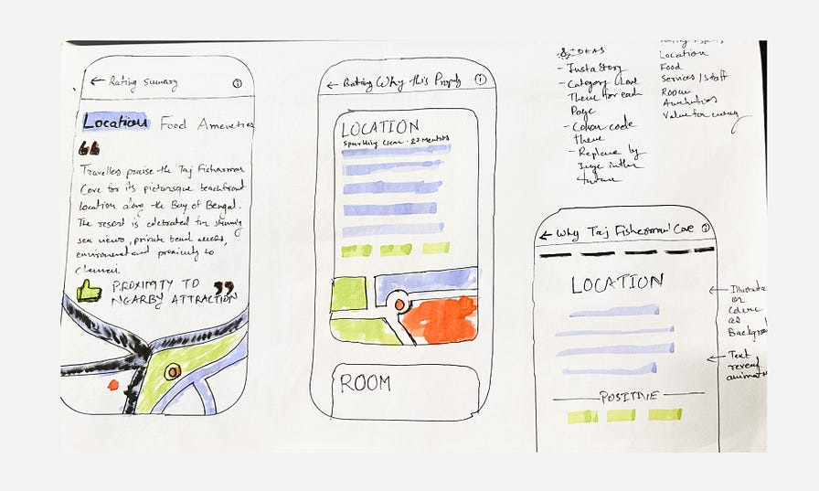
It would help to start with apparent ideas to warm up the brain. To clean up the creativity faucet, you must stick with the problem longer and be exhausted with apparent ideas.
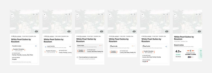
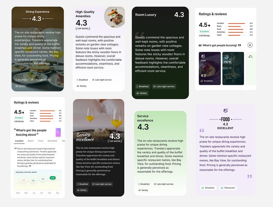
You will see the scrapped iterations, which brought everyone back to the whiteboard. These iterations resulted in earlier sketches, which helped us push boundaries when rethinking every pixel of the final version.
Considering the limited real estate and lot to fit in, we have explored mobile first iterations.
We also dig deeper to customise the experience based on the hotel chain’s star ratings. Imagine a different experience based on a hotel’s star category.
Hence, we have tweaked the card layout and label, such as “Value for Money” for 3-star hotels and “Value for Luxury” for 5-star hotels. We also decided to use different visual treatments.
All these iterations led us to the final version, a fusion of ideas.
Icons and Motion Design
Mobile — Property Highlights and Review Summary
Desktop — Property highlights and Review Summary
Chapter 4: Validate the concept, incorporate feedback and the pilot launch.
Breaking the rules of the conventional approach and rethinking reviews and ratings was an ambitious goal. We were all putting energy into solving what we thought was a problem.
Is it essential for the travellers?
Does it serve their purpose?
Does it help travellers shortlist hotels faster?
Does the review summary overpower the actual reviews?
Does it intrigue travellers?
We had hypotheses that needed validation before the pilot launch. We quickly tested the concept with 8–10 people. I designed the high-fidelity prototype for the UXR team to get the most out of the user testing.
80% of our hypotheses pass the test. We faced some ideas unnoticed by the user, and it unlocks new potential design solutions.
For example, users unnoticed the personalised hotel star category experience. We dropped the customised summary card idea, considering we need to take a bold approach rather subtly.
User interaction helps us rethink the experience and prioritise information that was earlier behind the click.
We also made design changes based on the critical feedback. There were no launch blockers, and we were ready for the pilot launch.
My takeaways
Macro Perspective: Spending more time solving one problem constrains the designer from following different approaches. When working on a large project, get the zoomed-out view more often. Regularly review with design peers who are not directly involved in the project.
Design-Tech Synergy: Understand the core workings through the tech by extending the learning scope beyond design. An engineer’s perspective of tech solutions or constraints may completely change the course of your design solutions.
Comprehensive Prototype: The prototype should be capable enough to function beyond the desired user testing goal. If most of the things work correctly, you will receive a lot of surprising feedback. It unlocks new potential design features and solutions.
Originally posted at medium

