The 60–30–10 Rule: A Simple Way to Create Catchy User Interfaces
If you are seeking for approaches to to achieving a well-balanced, visually appealing colour scheme, I would like to recommend the 60–30–10 rule. This approach provides a quick, reliable framework for organising colour that both harmonises and energises an interface. By using 60–30–10 rule, designers can create a sense of balance and focus that enhances the aesthetic of user interfaces.
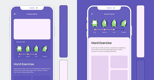
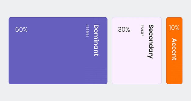
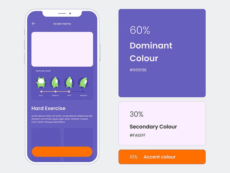
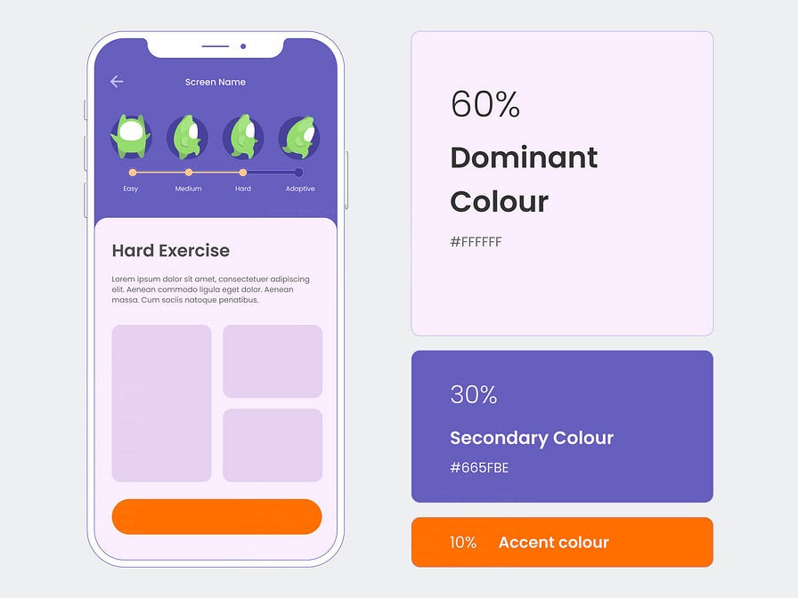
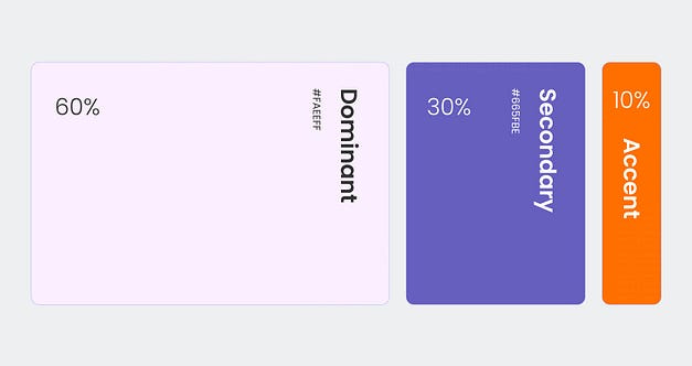
The 60–30–10 rule is one of the simplest guidelines for creating visually appealing and balanced designs. It provides a clear structure for colour distribution, making it easy to apply to any interface or design layout. With this rule, 60% of colour proposition should feature the primary colour, setting the overall tone and creating a cohesive look. Then, 30% is dedicated to secondary colours, adding supporting the primary colour without overpowering it. Finally, the remaining 10% is reserved for accent colours, adding a pop of contrast to highlight important elements and draw users’ attention.
In my perspective, there are two straightforward ways to effectively apply the 60–30–10 rule to a user interface.
1. Conventional Approach
60% allocation for dominant colour — giving the interface a bold, branded feel.
30% would be used as secondary colour — apply to smaller areas to provide contrast and interest while balancing the dominant colour.
10% remains for an accent colour — highlights essential elements, such as call-to-action buttons or alerts.
2. Flexible Approach
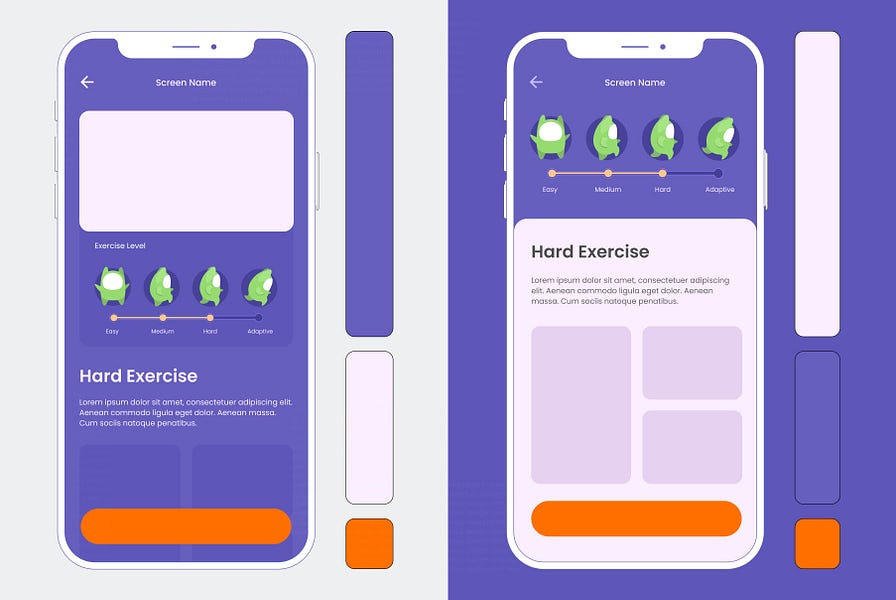
In applying the 60–30–10 rule, if the secondary colour is a neutral tone and provides strong contrast with the dominant colour, I often swap the dominant and secondary colour. This way, the secondary (now the dominant) colour occupies 60% of the interface, giving the design a balanced and clean look, while the original dominant colour still takes up 30% as a secondary colour.
Even with only 30% allocation, the dominant colour maintains brand presence, standing out clearly and representing the brand identity effectively within the design.
60% to the secondary colour as the background — provides a clean, cohesive foundation for the interface.
30% to the primary colour — to primary elements, such as components, illustrations, cards and navigation.
10% is reserved for accent colours — draws attention to specific details like icons, buttons or highlights.
When applying the 60–30–10 rule, you don’t have to measure colour percentages with exact precision. Instead, it’s more about keeping the general balance in mind: 60% 30% and 10%.
Hope this short article inspires you to create stunning and harmonious user interfaces.
Following me:
https://www.dinhhuy.design/
Originally posted Here

