The benefits of having annotations in your Figma file
When it comes to designing, keeping the focus on the final outcome is crucial. Annotations in your Figma files can be the key to achieving this. Here are some reasons why you should consider incorporating them into your workflow.
🏆 Maintain focus on the desired outcome: Annotations help you keep your eyes on the ultimate goal of the design, avoiding distractions and ensuring that each decision contributes to the desired result.
💬 Facilitate communication and design review: When sharing your designs with the team or stakeholders, annotations provide a clear guide on the design decisions made, making it easier to understand and discuss during reviews.
🤖 Self-explanatory for future reference: Annotations serve as valuable documentation for anyone who needs to access your Figma file in the future. They explain why certain design decisions were made, facilitating understanding and continuity of work.
👩💼 Increases professionalism and demonstrates your expertise: Incorporating annotations shows a level of attention to detail and professionalism in your work. It also demonstrates your experience and ability to think critically about your design decisions.
Background
I started using annotations in my design files a while ago and have since been refining my methodology to find what is most comfortable, practical, and functional for me.
Why put annotations in a design document?
Annotations have always helped me maintain focus on what I want to achieve with the design. At first, they were about visual or usability issues until a few years ago when my first annotation before any design was to write the outcome, objective, or key behaviour. This way, I focus on the value the design needs to achieve beyond its visual appearance.
I then started adding design decision explanations to remember the perspective, methodology, or principle I used to reach that solution. It also helped to make a list of versions and note the pros and cons of each version.
Annotations before starting to design
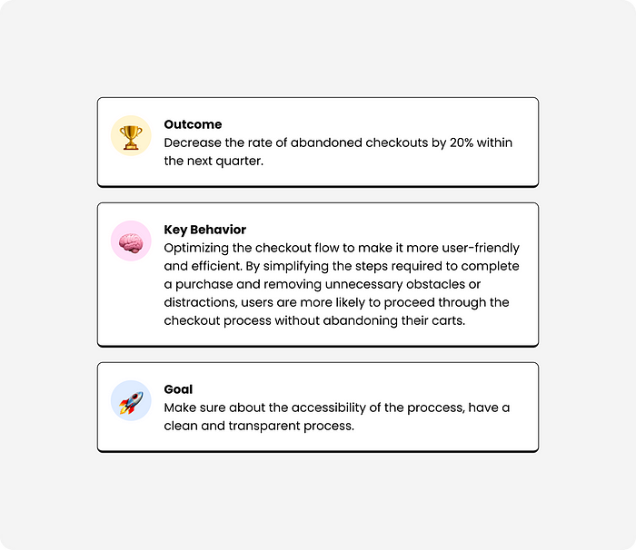
Goal, Outcome, or Key Behaviour
Differences between outcome, objective, and key behaviour. Which is the best?
There is no better or worse, the important thing is to have one of these three starting points to not jump straight to solutions without first stopping to think about what we want to achieve.
Outcome is the desired result or effect that is expected or intended to occur as a consequence of specific actions, initiatives, or efforts. It represents the ultimate goal or purpose that drives an individual, organization, or project forward. Outcomes are often measurable and observable, providing a tangible indication of success or progress.
Key behaviour refers to a specific action, pattern, or interaction that is fundamental to achieving a desired outcome or goal. It represents the observable actions or behaviours that directly contribute to the desired result.
Goal, this is more open and can be usability goals, journeys, or a specific task the user needs to perform.
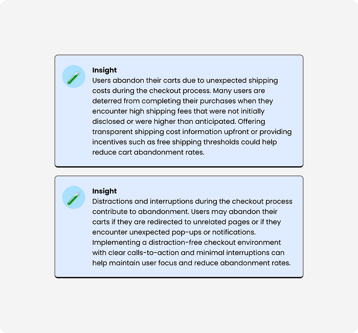
Insights from research
If you are going through a discovery process (as you should), you probably have insights from the research you conducted, for example, insights from a survey to validate a hypothesis, data from analytical research, etc.
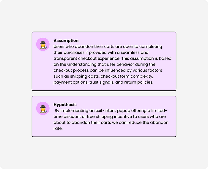
Hypothesis — Assumptions
In the case that the design is to validate a hypothesis through an A/B test or usability test, it is recommended to always keep the hypothesis below the objective.
Annotations complementary to the design
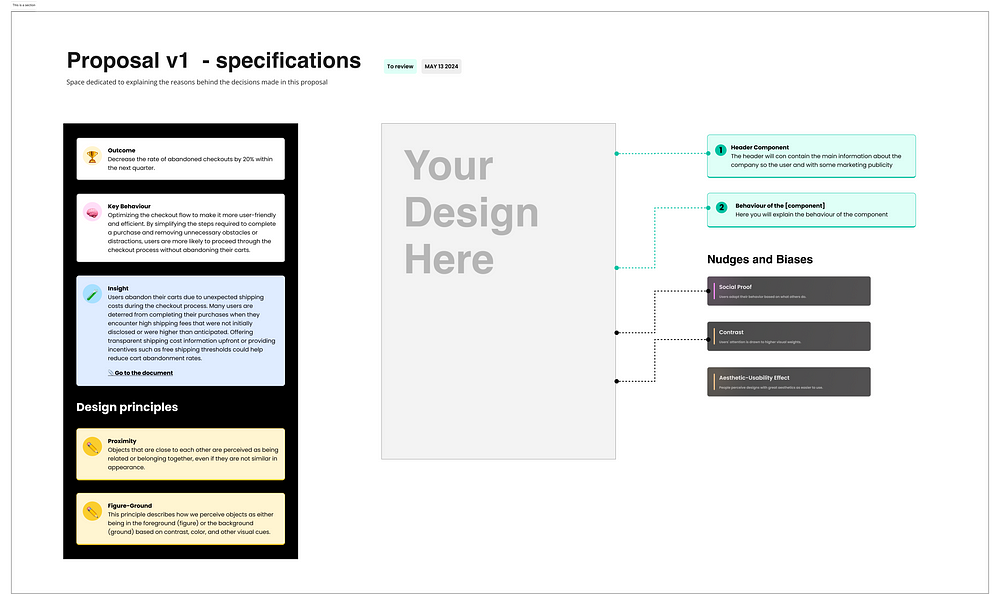
Once I have the design, I usually add different annotations to help me when presenting the design to stakeholders, design critics, or validation within the team. Let’s not confuse a formal presentation to stakeholders with an approach or keeping stakeholders informed of what we are working on. For a formal presentation, I recommend not doing it in Figma or at least not showing your workspace.
These complementary notes help me explain my decision-making with theoretical foundations and real data, thus avoiding doubts or uncertainties from the audience.
Cognitive biases
I tend to be very focused on behavioural science, so I always like to add those nudges or cognitive biases that I have used when designing. I’m using this Figma library.
Gestalt principles
Adding the basic principles of Gestalt used in design helps explain your designs to those who are not familiar with design, so I don’t always use these notes.
Specs
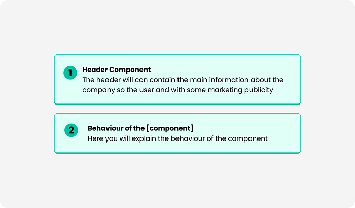
These notes are essential for explaining navigation flows, style decisions, or components in detail, and they also save you work when handing off to developers.
Organization of the Document
Now that my Figma document is not just a workspace, it is important that this workspace is well organized.
Sections, title, state
I usually use sections to organize the design, whether it’s by flows, states of a component, or groups of actions. To ensure that anyone, including myself, can understand how the sections are organized, I always add different levels of headings and the state in which those designs are.
Special sections
My special sections go beyond design, for example, I usually have a section to literally break down every design test I do or the famous edge cases, and another workspace where I always make a small prototype to see if the negation or interaction of what I am doing is human and recognizable, familiar, and responds to patterns known by users.
Conclusions
Over the years, I have learned that when it comes to keeping my Figma documents organized, more is more, but the number of elements in my designs is always conscious and complimentary. When I see that an annotation is not adding anything valuable, is redundant, or directly has nothing to do with the final result, it is always advisable to delete it.
Originally posted Here

